Adobe Lightroom Quick Tips: Super-Enhance Your Images With These Lightroom Tips
With all the crazy apps nowadays, enhancing your photos seems like the easiest thing ever – I mean, if even typical applications such as Picasa can help you bring out the color in your eyes and cheeks and make your vacation photographs sparkle, why do we need to complicate our lives with complicated editing software? This particular question was asked around Adobe Labs as well, and their answer to this problem was – Adobe Lightroom. It’s obviously a lot easier to use than Adobe Photoshop (if you’ve tried it, you know exactly what I mean), not to mention that it is designed to do exactly what a non-commissioned photographer needs – enhance their photos using some rather cool tricks.
I will not dwell on how to familiarize yourself with the interface, but I will focus on some interesting tips for you to use the next time you need to bring the spark into your photographs.
Lightroom version used for this article is 2.7 but most commands are similar in older versions.
Use The White Balance&Lightning Tool To Your Advantage
For those of you who are quite fond of tuning that white balance option on your camera but you don’t always seem to get it right, I have a solution. Fortunately, the guys at Adobe Labs thought of implementing a white balance option, which can make your image a lot more interesting with just a move of the dial. Here’s what I got out of it:
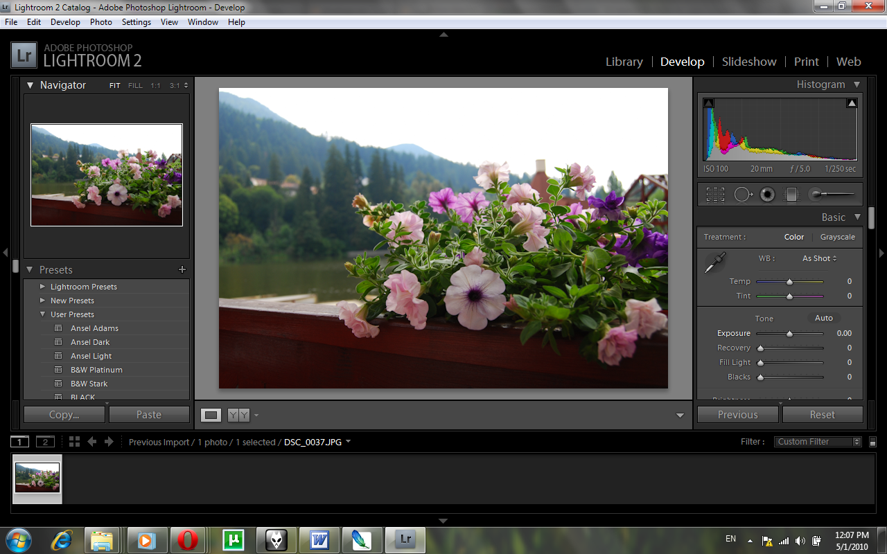
Adobe Lightroom 2
And after I played around with the dial:
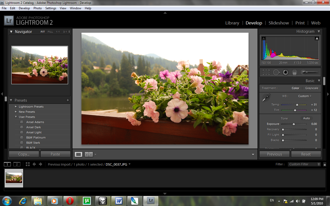
Adobe Lightroom 2
Obviously – you can tune it to whatever you need – I wanted to try a bit of that “summer afternoon” light. However, simply adjusting the white balance won’t make your picture gorgeous all of the sudden. As you can see, it seems to be a bit too much light in the picture, therefore it would be wise to consider adjusting the lighting in the photograph as well.
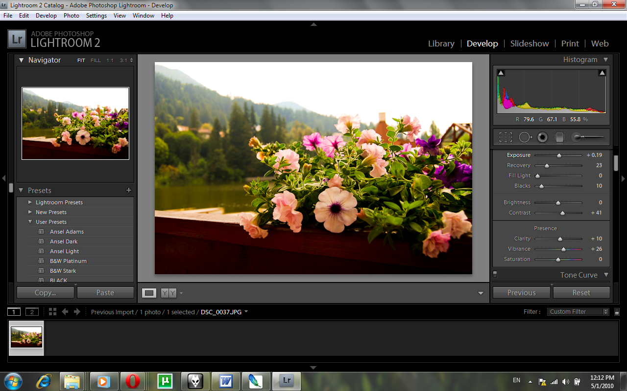
Adobe Lightroom 2
As you can see, colors have become more vibrant, the wooden balcony has a really pretty red color, and the leaves truly stand out making it a very interesting mix.
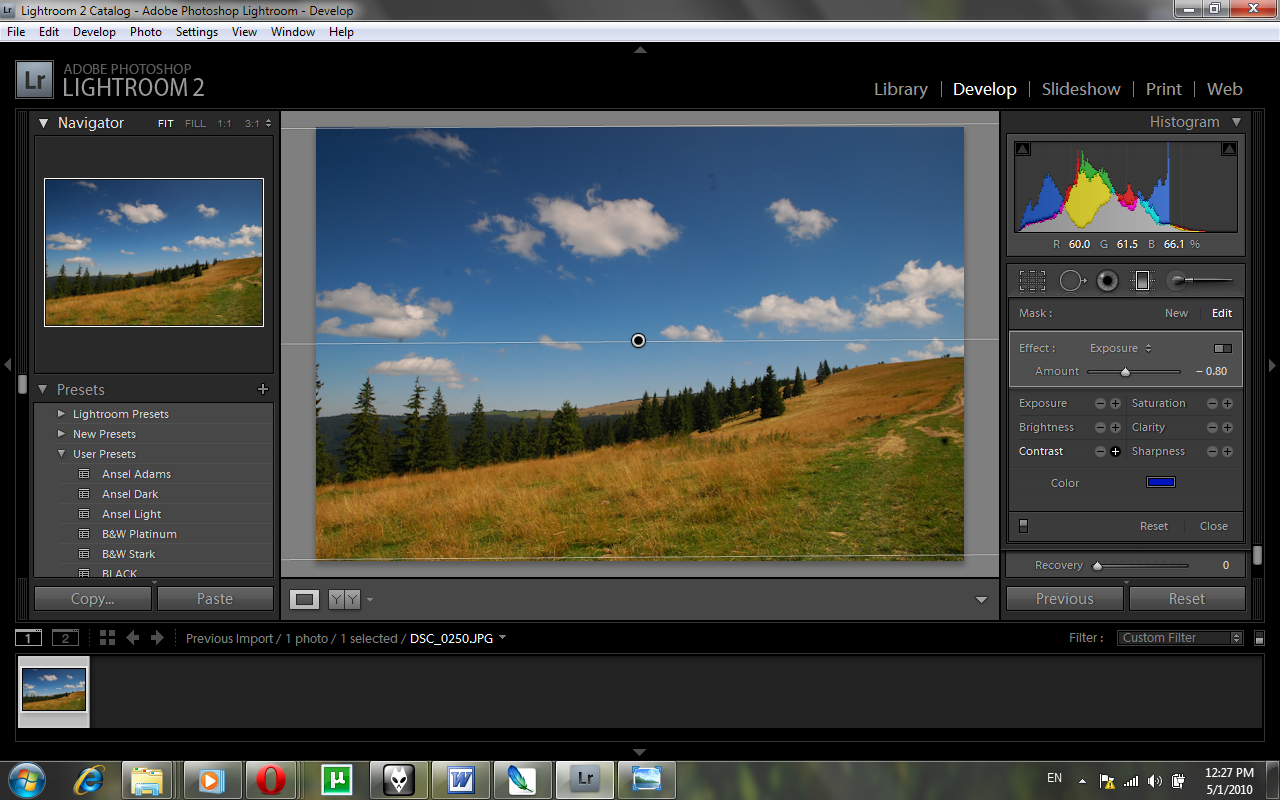
How To Use The Gradient Tool As A Gradual Filter
Now, most of us really love those gradient filters, but having one for all your lenses can be either expensive (or too much of a stretch if you’re not all that much into photography). Thing is, to compensate for the lack of filters, you can use the Gradient tool to enhance a beautiful skyline (or for that matter, you can use the gradient tool for whatever you want, but it works great with skies filled with clouds, like the ones in the picture below).
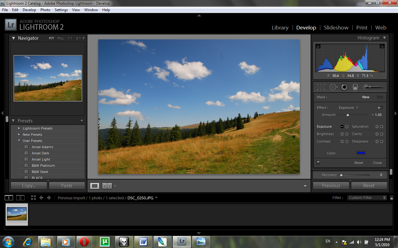
Adobe Lightroom 2
First of all, notice the Exposure bar and use it right. This picture I’m working was taken in the middle of the day, therefore if I am to graduate something in it, I cannot go for something too underexposed or else it would make a rather awful contrast with the rest of the picture. What I can do however, is tune it down a bit, and see how that works out. Also, notice that you can adjust the color of your gradient – I opted for a shade of blue since it’s going to enhance the blue in my image. I will drag the gradient line about an inch away from the hilltop. And here’s what I got:
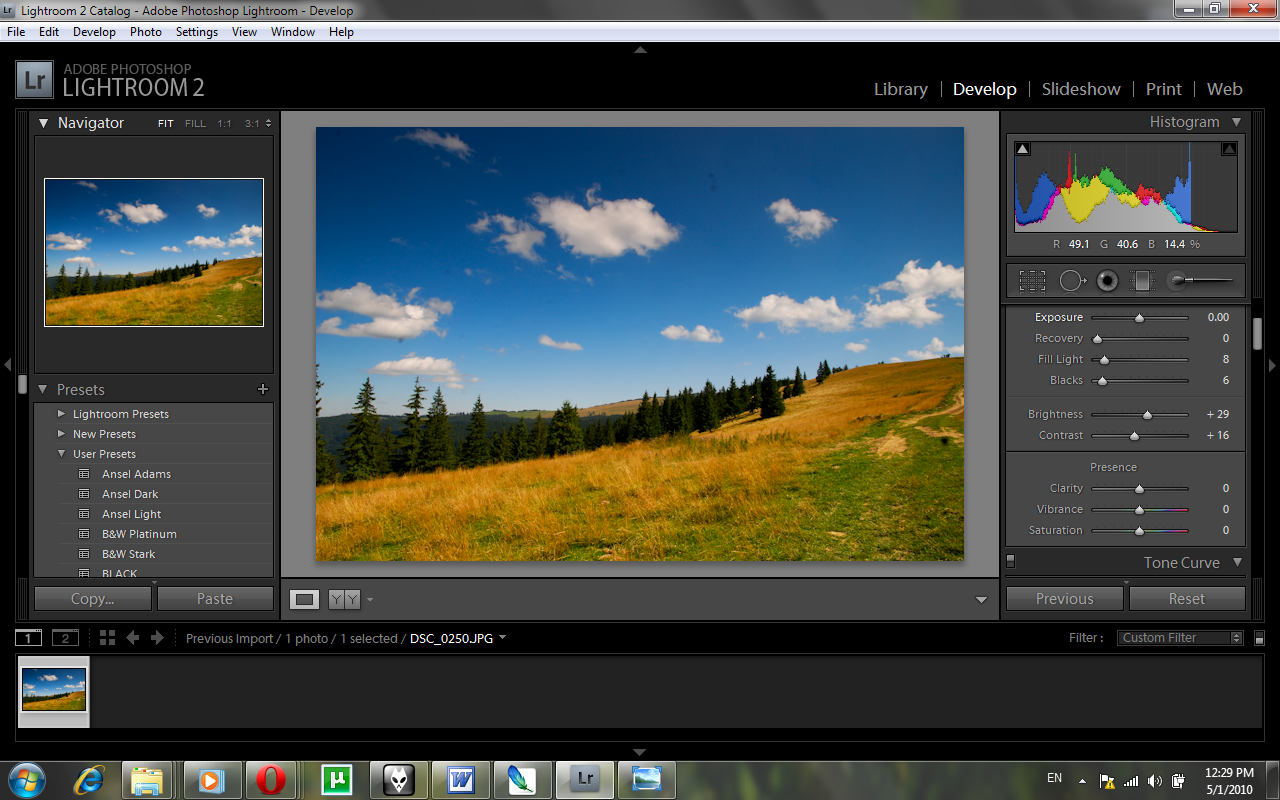
Adobe Lightroom 2
I used the contrast tool a bit in order to enhance the blues even further, but left all other options intact. I want to show you how much you can achieve with this little (but hey, you can play with the dials based on your own imagination). Thing is, just adding a filter may make the picture look a bit fake and unnatural – so we will try to correct that using the basic adjustments (those involving lightning and contrasts). I found it very important to add a bit more brightness and a bit more shadows to the picture, not to mention a few drops of contrasts. Here’s what I got:
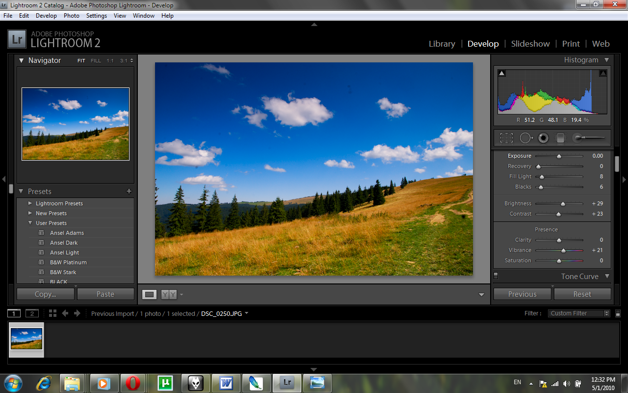
Adobe Lightroom 2
So, a simple boring picture just became a bit stunning, with just a few adjustments.
Fast And Effective Color Management Techniques
We’ll keep working on the same picture since it has quite a lot of potential, and we’ll try to bring more life to it now that we’ve opened Pandora’s Box (or Adobe Lightroom for that matter).
Adobe Lightroom 2
Now, here I went for those White Balance buttons I told you about in Tip #1 – and went from plain, to a bit more blue and a bit more magenta. I won’t tell you the exact numbers since I want you to learn on your own as well – just play around with the dials until you’re satisfied with the result (this way it’s never boring). Then I added a bit more brightness and contrast to the picture to enhance the remaining areas.
But let’s talk color management now – it’s obvious that you can bring out quite some interesting stuff using those simple dials, but why not work on color channels for a change?
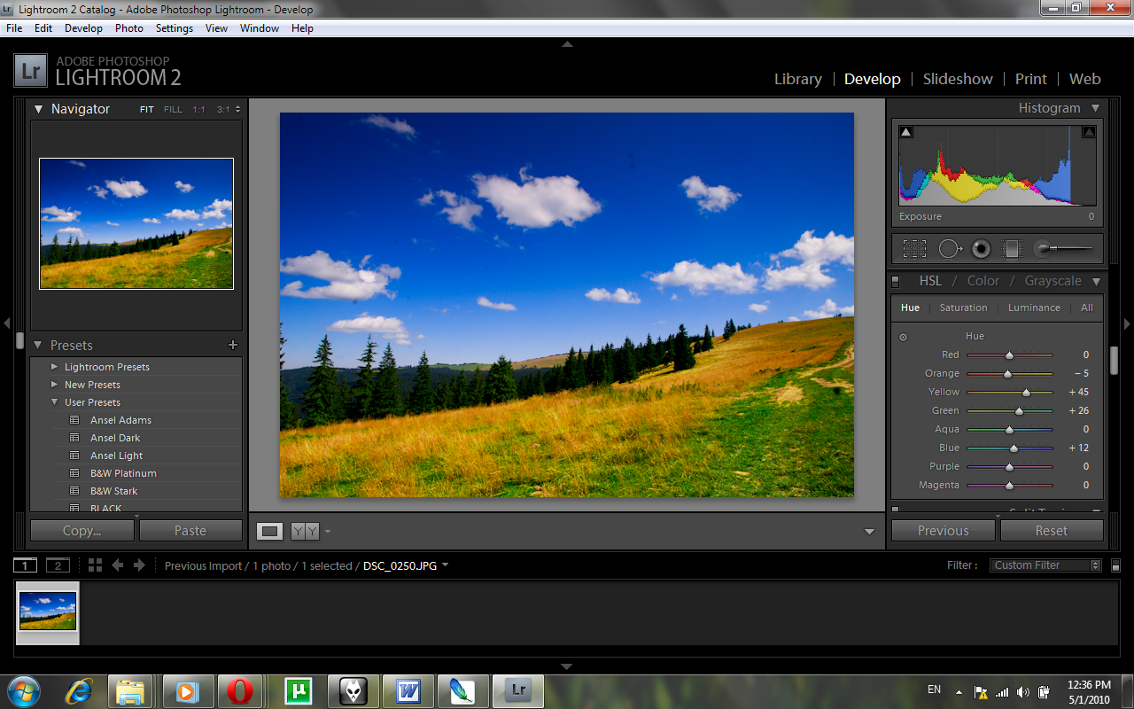
Adobe Lightroom 2
All of the sudden, you have control over each color – you want yellow to become green? Go right ahead! You want yellow to have a tint of red? Just tickle the dial a bit and you’ll notice some interesting results in a few seconds. Just be careful – all this coloring will need to remain in the natural side, so your picture won’t become tacky – I mean, you wanted to enhance your picture, not make it look like something an amateur drew up in Paint, right?
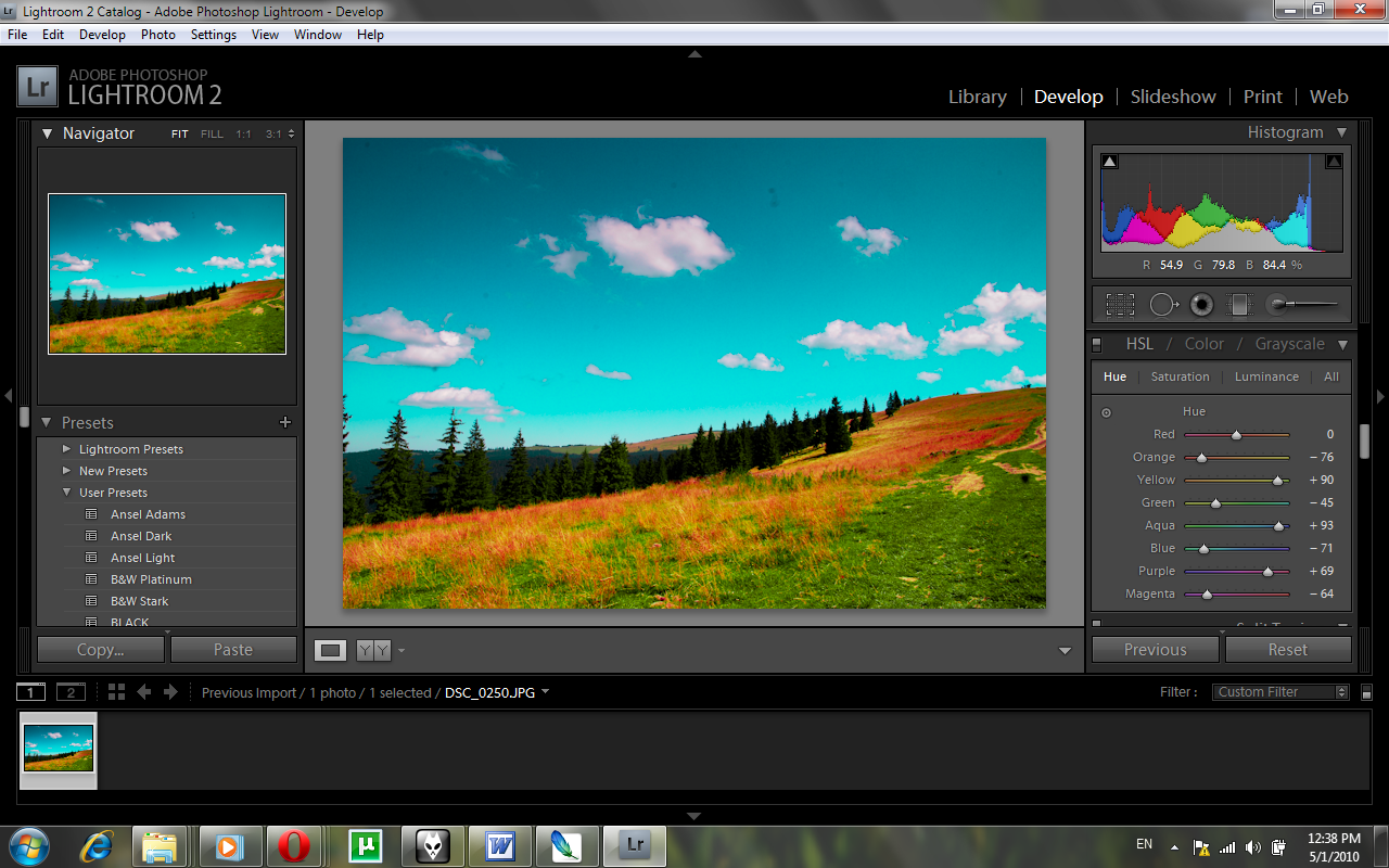
Adobe Lightroom 2
This is obviously bad!
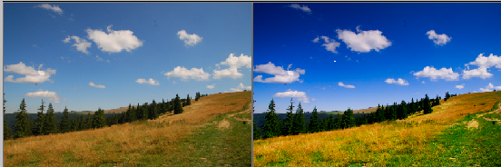
Now that we’ve established what’s tacky and what’s not, I think you’re ready to play a bit on your own with these new Lightroom tips. But before you go, take a look of how the picture looked before our little play, and after:
Adobe Lightroom 2