Lightroom 2 Tips and Tricks
Post-processing has reached a new era ever since people have learned to shoot their pictures in RAW. Before I wrote this article I took some time to think whether it would be a good idea to show you the miracles of RAW or whether it would be more interested to show the good Lightroom can do to a mere JPG image. Even if this particular article will not be a step-by-step tutorial I will make sure no part (of the article) of it is left unexplained. I used the new version of Adobe Lightroom, more precisely Adobe Lightroom 2.3
First, we shall upload the photo to our working space in Adobe Lightroom. You can do this by using the File>Import from Disk setting, or simply through Drag and Drop. There is no difference between the two, just in purpose. No matter which one you choose, your window should now look something like this:

Now, we shall move from the Library selection to the Develop selection. Look for the five tabs on the upward right corner of the screen. Currently, the selected one should be “Library” all you have to do is switch to Develop. A completely new screen should appear in the right side of Adobe Lightroom, and the first thing you will notice is the White Balance setting immediately under tlhe histogram. Play a little with the slider and notice what happens with your image, how it changes its color temperature. I have changed mine slightly to magenta and slightly to yellow to obtain the following image.

Now we move on to the next selection – the Tonal correction part (you will find it right underneath the WB options). Here you can correct the exposure you originally set for your picture, adjust the lightning in your picture and how prominent the blacks should be. Brightness and contrast can also be adjusted here. Remember however that modifying contrast can lead to losing colors and making the whole picture overexposed. Here is how I changed my picture:

Next comes the Presence set of options. Here you should be able to correct the saturation of your colors. Aside from the obvious saturation option, there are two options concerning the clarity of each color along with its vibrancy. Nevertheless, avoid over-saturating the color since it will not necessarily have a great effect on the retina of the viewer. Here is how I adjusted my photo:
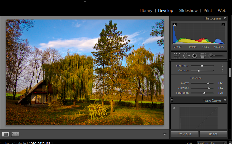
As you can see, the blue in the sky is rather cyan-ish and it clashes with the whole picture. This is what I meant through the wrong type of saturation – however, the trees and grass turned out quite interesting, therefore I will get around to correcting the sky a bit later.
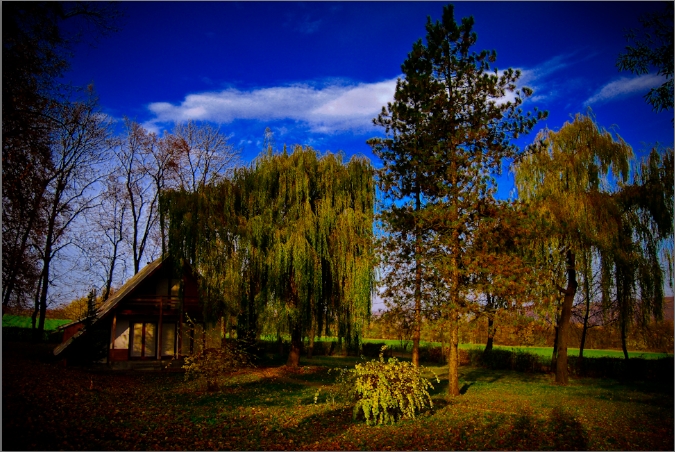
Tone Curve in Adobe Lightroom
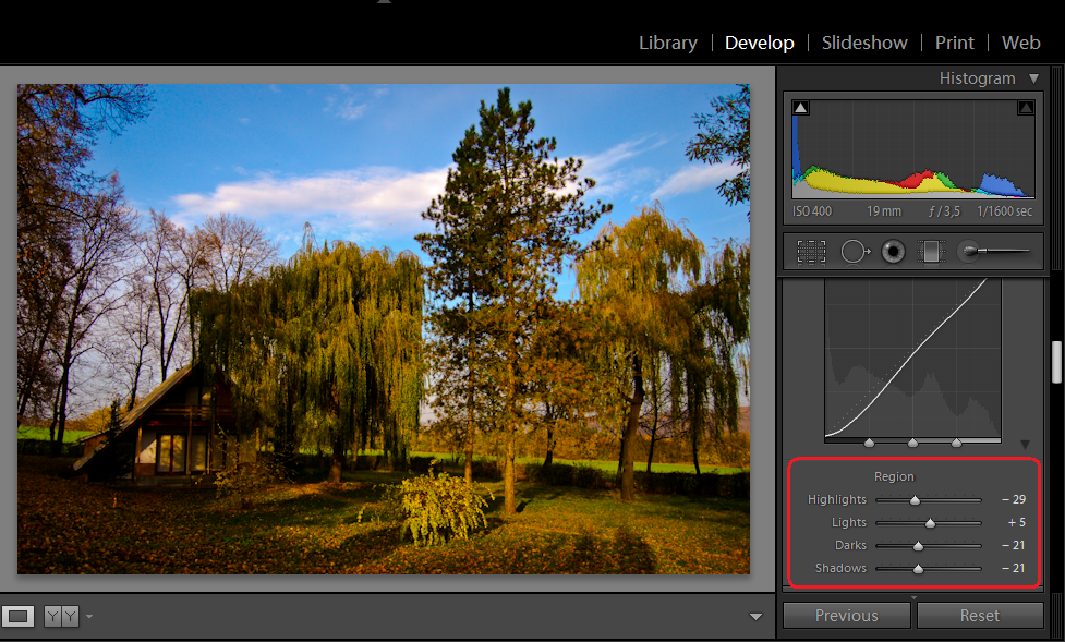
We move now to the Tone curve section. Here you have two options – you can either work on the curve itself, or you can use the actual settings. In the beginning, I recommend working on the actual sliders since working on the graph requires more attention, not to mention some experience. The highlights slider will adjust how your lighter parts of the image look like – you can adjust them to be a bit more prominent, or you can reduce the glare – I chose reducing the glare a bit since it gave me less shine in the sky section. Lights and darks work on the darker and lighter parts of the picture (it is easier to see their effects by simply moving the sliders) and finally the shadows part will either enhance or diminish how acute the shadows look.
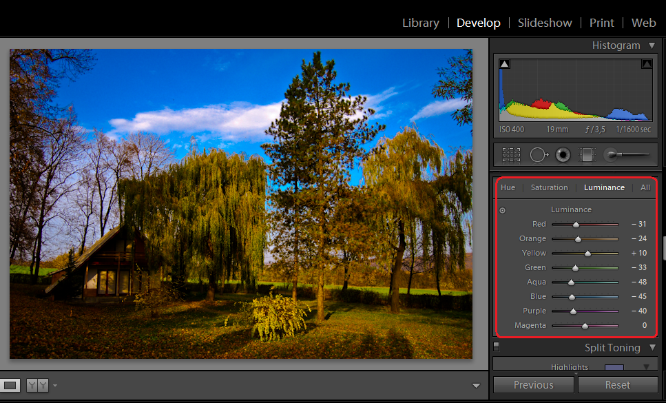
Now, you will look at the HSL/Color/Grayscale menu in Adobe Lightroom Frankly, I would advise working on the HSL menu since it gives the greatest flexibility with minimum annoyance. The HSL menu will first open in the Luminance tab, where you should be able to correct the density of each color. Since the problem in my picture was the prominent yellow and the annoying cyan, I adjusted the luminance accordingly. I obtained this result:
Correcting the sky in Adobe Lightroom
As you can see, the color of the sky is more bareable, however, there some issues with the green and yellow (and the sky still seems a bit too blue). Therefore, I moved on to the Hue section, where I was able to change the hue of each color.
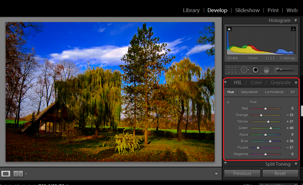
I think that the sky has a more interesting color at this point, not to mention that the adjustments I made in the Orange and Yellow sector brought the picture to a more natural look.
Now we move on towards the Sharpening/Noise Reduction/Chromatic Aberation section. The thing with sharpening is that you should never move the slider too much in the right because you will end up having to deal with noise, and if the picture was not sharp in the beginning, it probably will not get too sharp after all. Slight sharpening is ok, but remember that everything has its limits. Chromatic Aberation should only be taken into consideration if the picture requires it as an artistic effect.

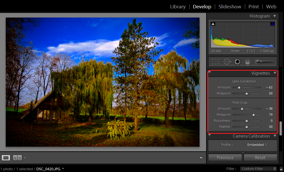
In the vignettes section, I would recommend your own gameplay. Usually, vignettes are quite interesting with squared photos that have a centered subject, since then vignetting is actually useful. However, you have to know what type of vignettes suit your picture, and when should you apply them. In this case, slight vignetting was considered, due to the fact that it is a wide view, and there is no center point to focus on. If there was, I would have probably put in a more prominent vignette.
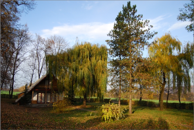
The results from Adobe Lightroom
Here’s a before and after:
Have fun with these Adobe Lightroom tips and tricks.